Improving my website's performance (Part - 1) - Image Optimizations

Part 1: Image Optimization for my website
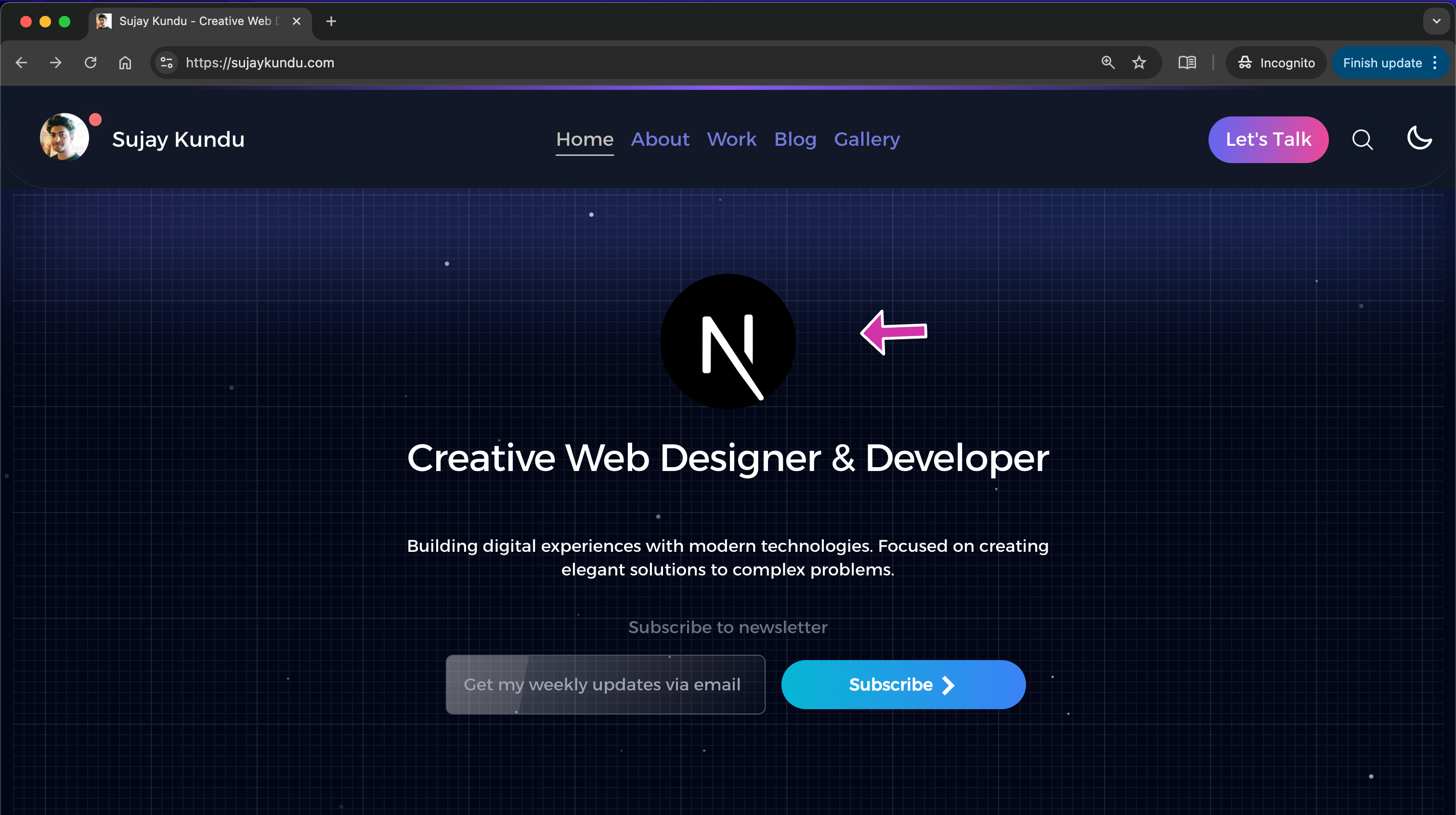
When I first ran a Lighthouse audit on my website, I was surprised — my design looked clean and modern, but the performance score told a different story. The culprit? Images.
Like many developers, I had uploaded nice-looking visuals without thinking much about file size, delivery format, or responsive scaling. But unoptimized images can be one of the biggest bottlenecks in web performance, directly hurting Core Web Vitals (especially Largest Contentful Paint).
In this article, I will share what I learned while fixing my site's images — the mistakes I made, the optimizations I implemented, and the impact on performance.
The Fixes I Implemented (summary)
If you like to watch on video :
You can read my detailed article on Strategies for Optimizing Images for better web performance which goes in depth about each of these techniques.
1. Switching to Modern Formats (WebP / AVIF)
Example (Next.js next/image automatically serves WebP/AVIF when supported):
import Image from "next/image";

export default function Hero() {
  return (
    <Image
      src="/assets/images/balloons.jpg"
      alt="Colorful Balloons"
      width={1200}
      height={600}
      priority
    />
  );
}
2. Using Responsive Images and the dimensions i rendered (srcset)
Instead of serving one giant image, I generated multiple sizes and let the browser choose the best one.
<img
  src="balloons-800.webp"
  srcset="balloons-400.webp 400w, balloons-800.webp 800w, balloons-1200.webp 1200w"
  sizes="(max-width: 600px) 400px, (max-width: 1200px) 800px, 1200px"
  alt="Colorful Balloons"
/>
This prevents a mobile device from wasting bandwidth on desktop-sized images.
⸻
3. Converting small Images to Base64
This has been the best hack for fixing the LCP, I first converted the images to the required dimensions in webp format, and then converted this images to Base64 string, which i injected in the img code directly.
 {/* <Image
    src={"/images/sujay.png"} // instead use base64
    alt={`Availability Status of Sujay is ${statusText[status]}`}
    width={150}
    priority
    id="availability-status"
    height={150}
    aria-label="Availability Status of Sujay"
  /> */}

<Image
    src="data:image/png;base64,iVBORw0KGgoAAAANSUhEUgAAAOEAAADhCAYAAAA+s"
    alt={`Availability Status of Sujay is ${statusText[status]}`}
    width={150}
    id="availability-status"
    height={150}
    aria-label="Availability Status of Sujay"
/>
3. Lazy Loading Images Below the Fold
In React/Next.js, next/image has loading="lazy" by default.
 import Image from 'next/image';

 <Image
    loading="lazy" // add this
    fetchPriority="low" // add this
    src={optimizedAvatarUrl.toString()}
    alt={avatarAlt}
    width={width}
    height={height}
    className="rounded-full object-cover"
    priority
  />
Current State (July 25, 2025)
The Vercel Experience score is at 73 of this website, need to improve
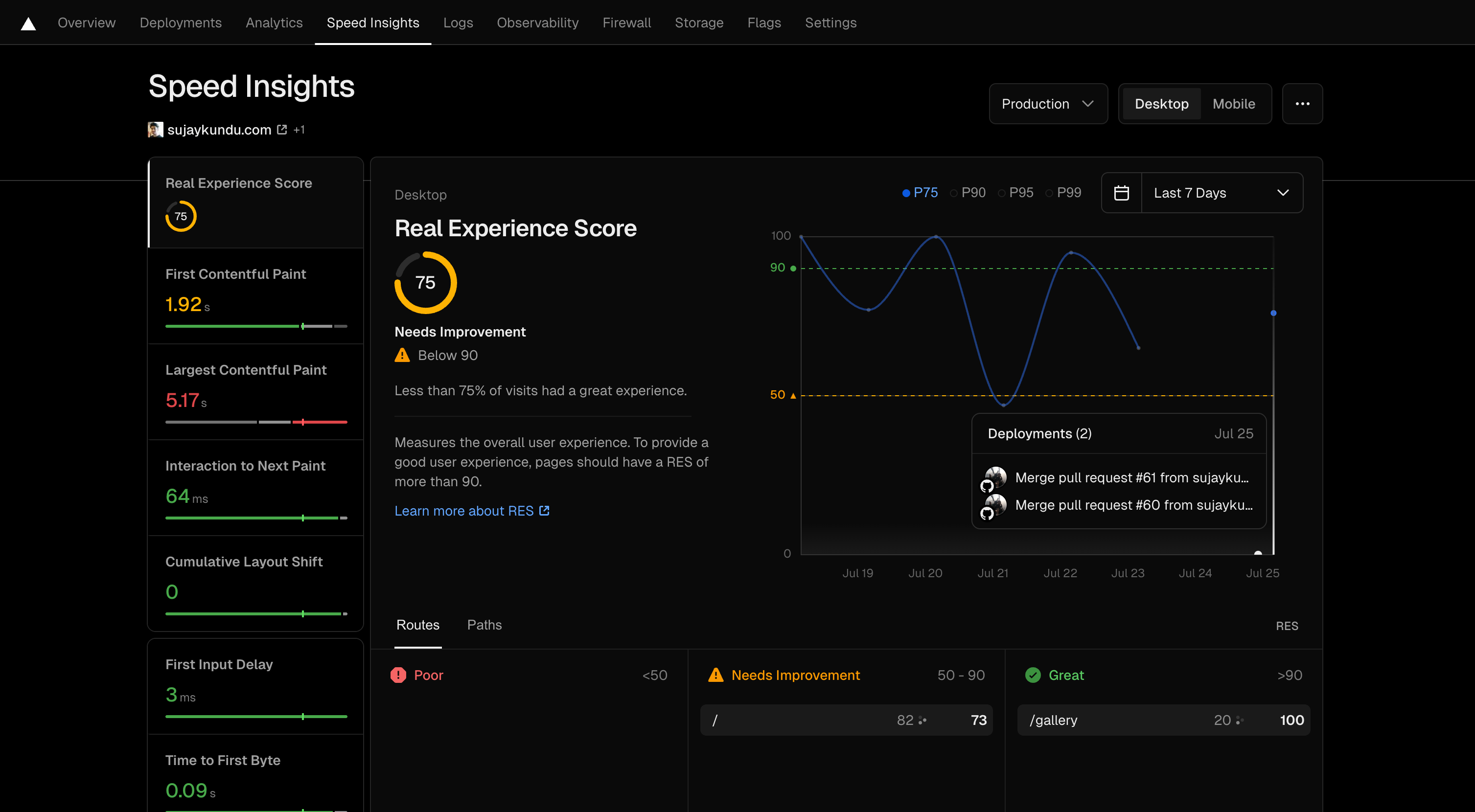
In this series, I am going to show you what steps i am taking to improve my site's web performance.
Large images were loading in the guestbook comp on the Homepage
1. Fixed - Optimizing images for guestbook
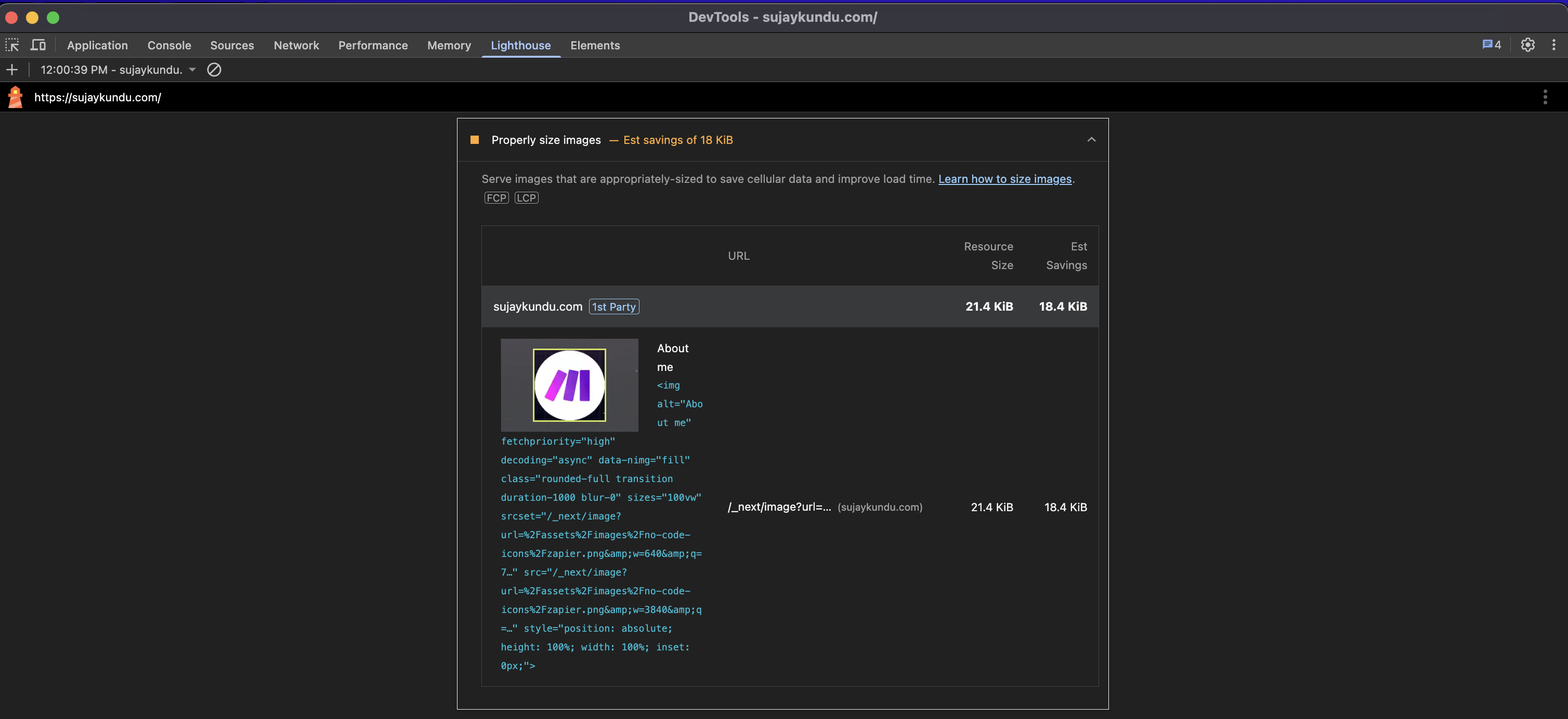
So if you visit my website's homepage Home, the lighthouse in Chrome yelled saying that images were not optimized for images coming from guestbooks profile images of the list view.

Guestbook images were not loading according the required size, they were larger in size, So i need a way to optimize this images based on the size i am rendering.
The Images that were loading were coming from the github api, to make the images transform based on width and height, i had to pass in a query to the api, so that it renders accordingly.
There is article by Google Lighthouse page on Properly sized images - optimizing images and Lighthouse calculates this scores.
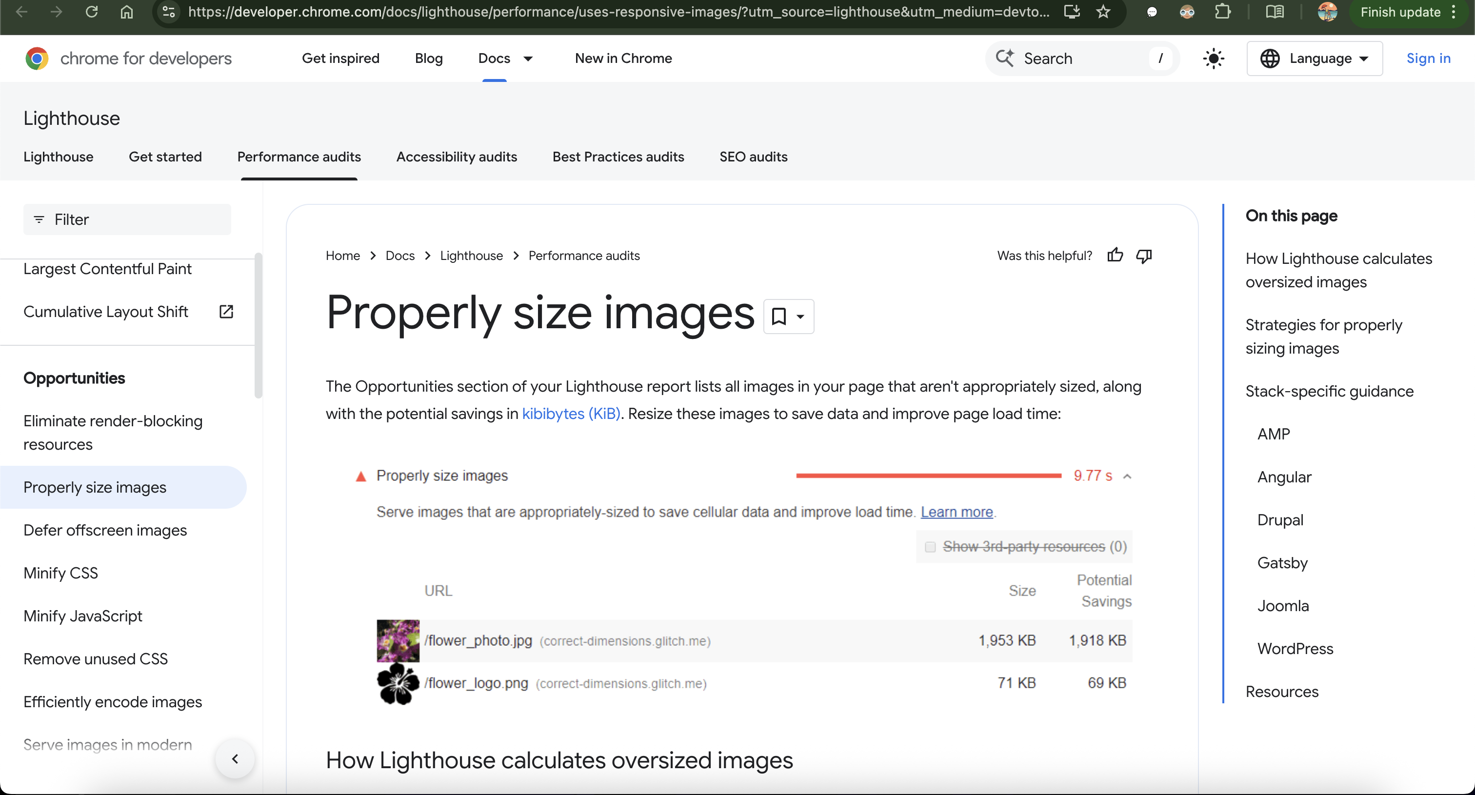
so all i had to do was attach the '?s=width' to the api with the required width, currently in my case it was "40px", optimizing it with the next/image. it came pretty well.
<Image
    src={`${avatarUrl}&s=${width}`} // appending the size query
    alt={avatarAlt}
    width={width}
    height={height}
    className="rounded-full object-cover"
    priority
/>
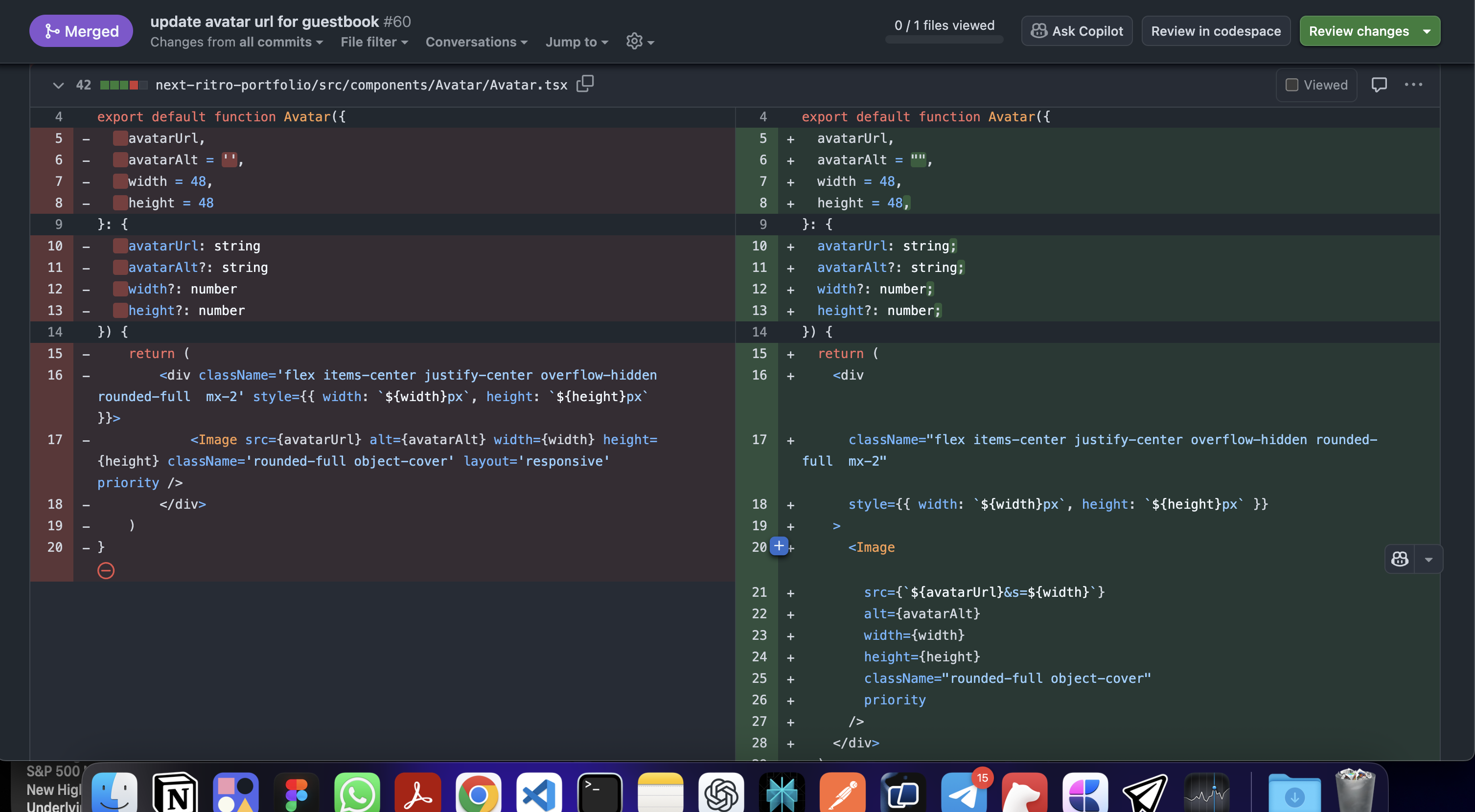
so i had to optimize the code to support the proper width of the avatar images:
"use client";
import Image from "next/image";

export default function Avatar({
  avatarUrl,
  avatarAlt = "",
  width = 48,
  height = 48,
}: {
  avatarUrl: string;
  avatarAlt?: string;
  width?: number;
  height?: number;
}) {
  // Optimize GitHub avatar URL by adding size parameter
  const optimizedAvatarUrl = new URL(avatarUrl);
  optimizedAvatarUrl.searchParams.set("s", Math.max(width, height).toString()); // ?s="48" // width of 48px

  return (
    <div
      className="flex items-center justify-center overflow-hidden rounded-full  mx-2"
      style={{ width: `${width}px`, height: `${height}px` }}
    >
      <Image
        src={optimizedAvatarUrl.toString()}
        alt={avatarAlt}
        width={width}
        height={height}
        className="rounded-full object-cover"
        priority
      />
    </div>
  );
}
Now the score has bumped a bit to 99 for the Homepage. a bit of improvement on the Lighthouse Scores.
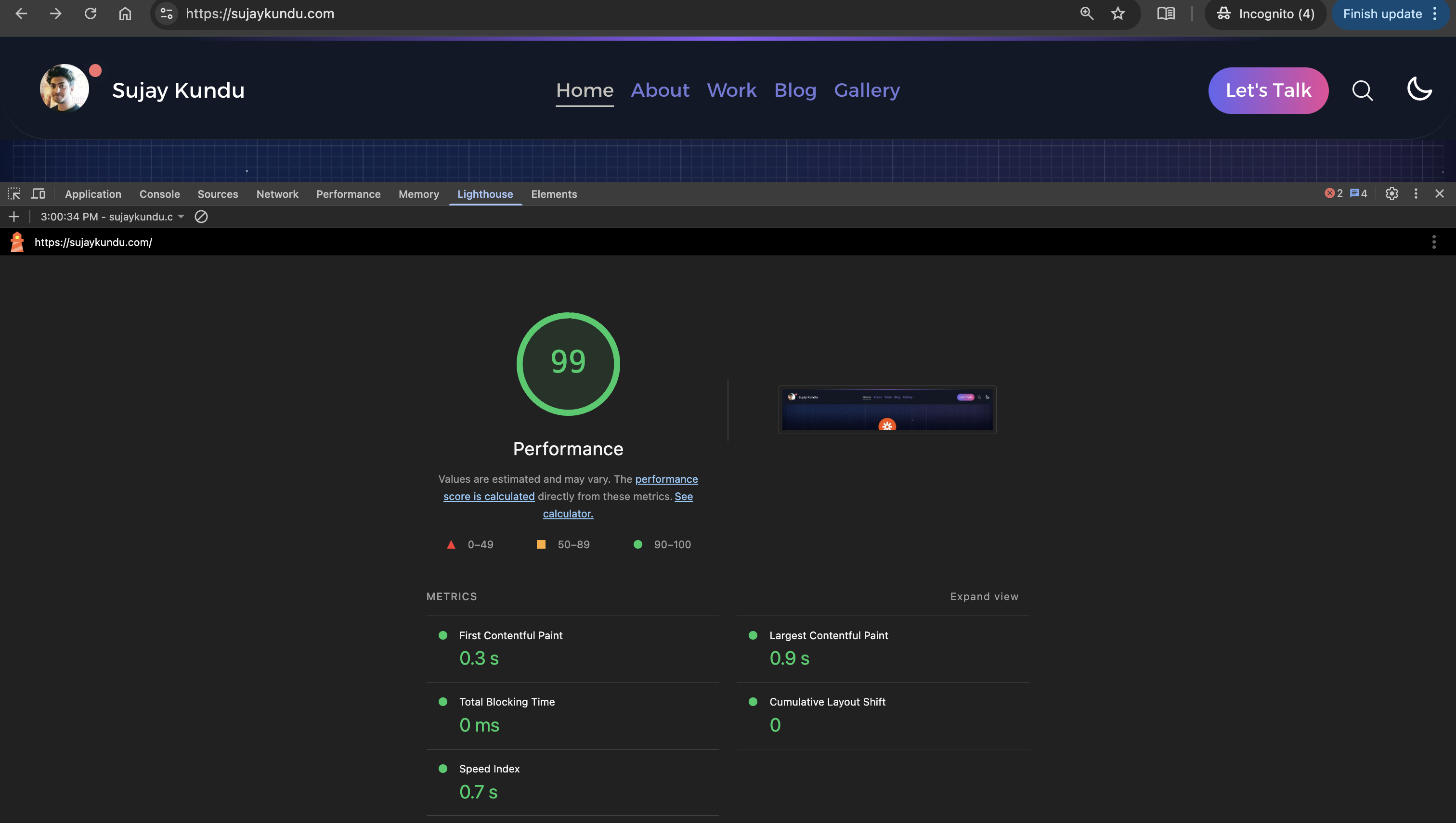
Current State (July 31, 2025)
Today, I ran the performance check for Desktop view again for lighthouse in Chrome (Incognito mode) by visiting https://sujaykundu.com
So today I found this issue:
So I have a component for showing rotating images, but this images are not optimized
So, I actually fixed it by optimizing the component, so the old component looked something like this:
"use client";
import Image from "next/image";
import { useEffect, useState } from "react";

export const AutoImageChange: React.FC<{
  imageUrls?: string[];
}> = ({ imageUrls }) => {
  const [currentImage, setCurrentImage] = useState(0);
  const [currentImageSrc, setCurrentImageSrc] = useState("");
  const [isReady, setIsReady] = useState(false);

  let imagesToChange = [
    "/assets/images/img0.jpg",
    "/assets/images/img1.png",
    "/assets/images/img2.jpg",
    "/assets/images/img3.jpg",
    "/assets/images/img4.jpg",
    "/assets/images/img5.jpg",
  ];

  if (imageUrls) {
    imagesToChange = imageUrls;
  }

  const handleImageTransition = () => {
    setIsReady(true);
  };

  useEffect(() => {
    const interval = setInterval(() => {
      setIsReady(false);
      const newImage = (currentImage + 1) % imagesToChange.length;

      setCurrentImage(newImage);

      setCurrentImageSrc(imagesToChange[newImage]);
    }, 2000);

    return () => clearInterval(interval);
  }, [currentImage]);

  return (
    <div className="avatar">
      <div className="w-20 md:w-32 rounded-full">
        <Image
          src={currentImageSrc || imagesToChange[0]}
          alt="About me"
          className={`rounded-full transition duration-1000 ${
            isReady ? "blur-0" : "blur-sm"
          }`}
          fill
          // width={100}
          // height={100}
          onLoad={handleImageTransition}
          priority
        />
      </div>
    </div>
  );
};

export default AutoImageChange;
So earlier, the images were not having proper width and height, and the images were
So I optimized the component as below :
"use client";
import Image from "next/image";
import { useEffect, useState, useCallback, useMemo } from "react";

type AutoImageChangeProps = {
  imageUrls?: string[];
  interval?: number;
  width?: number;
  height?: number;
  className?: string;
};

const useImageRotation = (images: string[], intervalDuration: number) => {
  const [currentIndex, setCurrentIndex] = useState(0);
  const [isReady, setIsReady] = useState(false);

  const rotateImage = useCallback(() => {
    setIsReady(false);
    setCurrentIndex((prevIndex) => (prevIndex + 1) % images.length);
  }, [images.length]);

  useEffect(() => {
    const interval = setInterval(rotateImage, intervalDuration);
    return () => clearInterval(interval);
  }, [rotateImage, intervalDuration]);

  return {
    currentImage: images[currentIndex],
    isReady,
    setIsReady,
  };
};

export const AutoImageChange: React.FC<AutoImageChangeProps> = ({
  imageUrls,
  interval = 2000,
  width = 128, // default width for md breakpoint
  height = 128, // default height for md breakpoint
}) => {
  const defaultImages = useMemo(
    () => [
      "/assets/images/img0.jpg",
      "/assets/images/img1.png",
      "/assets/images/img2.jpg",
      "/assets/images/img3.jpg",
      "/assets/images/img4.jpg",
      "/assets/images/img5.jpg",
    ],
    []
  );

  const images = useMemo(
    () => imageUrls || defaultImages,
    [imageUrls, defaultImages]
  );

  const { currentImage, isReady, setIsReady } = useImageRotation(
    images,
    interval
  );

  const handleImageTransition = useCallback(() => {
    setIsReady(true);
  }, [setIsReady]);

  // Calculate responsive dimensions
  const mobileWidth = Math.round(width * 0.625); // 20/32 ratio for mobile
  const mobileHeight = Math.round(height * 0.625);

  return (
    <div className="avatar relative">
      <div
        className="relative rounded-full border-blue-50 dark:border-blue-900 border-2"
        style={{
          width: `${width}px`,
          height: `${height}px`,
          ["--mobile-width" as string]: `${mobileWidth}px`,
          ["--mobile-height" as string]: `${mobileHeight}px`,
        }}
      >
        <Image
          src={currentImage}
          alt="image-1"
          className={`rounded-full transition duration-1000  ${
            isReady ? "blur-0" : "blur-sm"
          }`}
          fill
          sizes={`(max-width: 768px) ${mobileWidth}px, ${width}px`}
          quality={90}
          style={{
            objectFit: "cover",
            width: "100%",
            height: "100%",
          }}
          onLoad={handleImageTransition}
          priority
        />
      </div>
    </div>
  );
};

export default AutoImageChange;
And then resized all my images to use width and height "128px", when used with the AutoImageChange component by passing width and height as "128px" and compressed images.
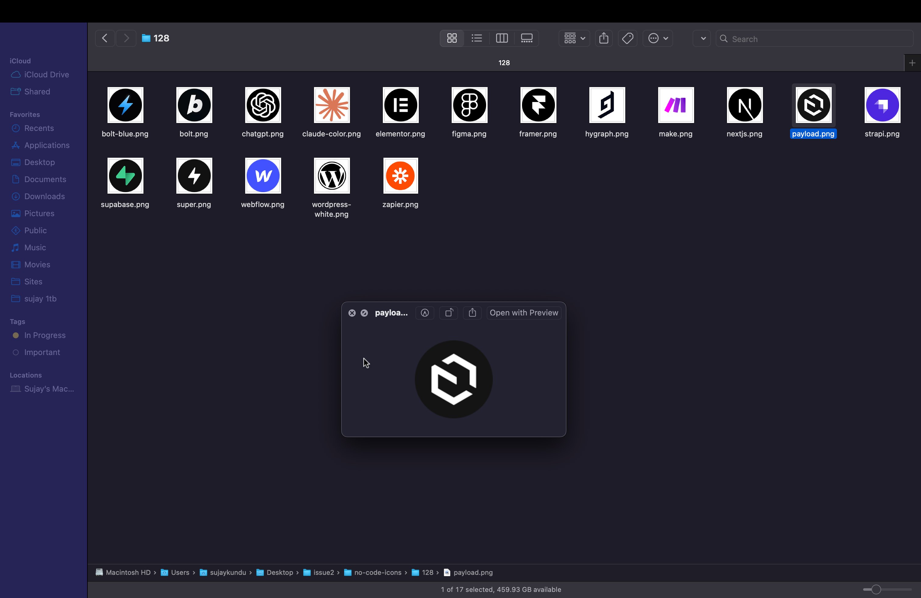
Resizing the images with Figma Export
So as you can see i have different sizes, which i made it same
Before :
After
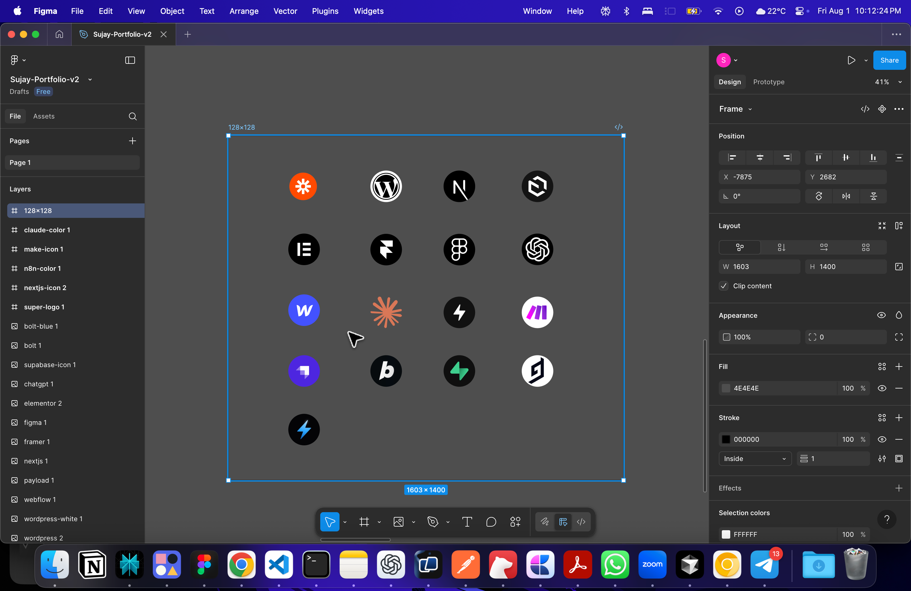
Then I exported all the images in png format
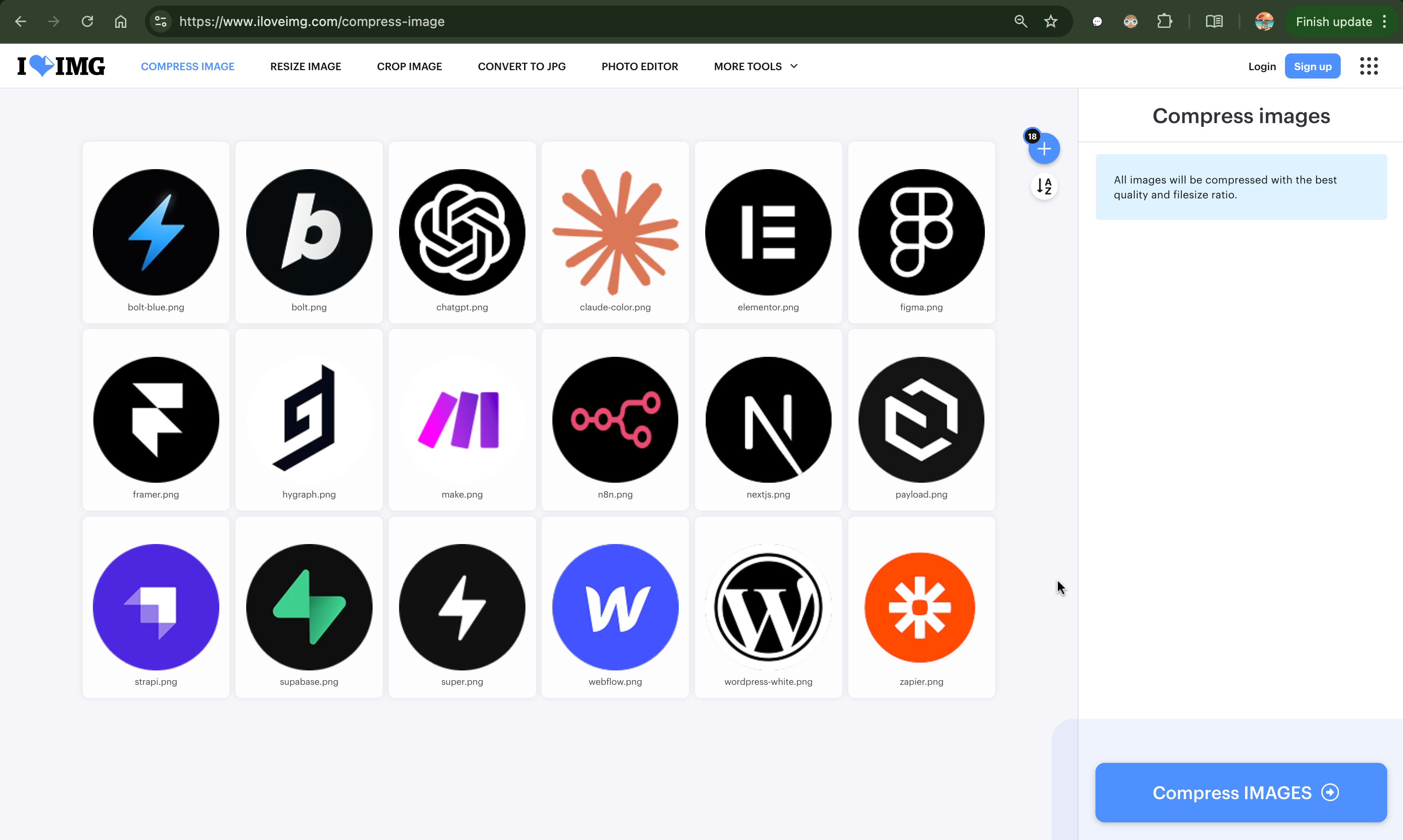
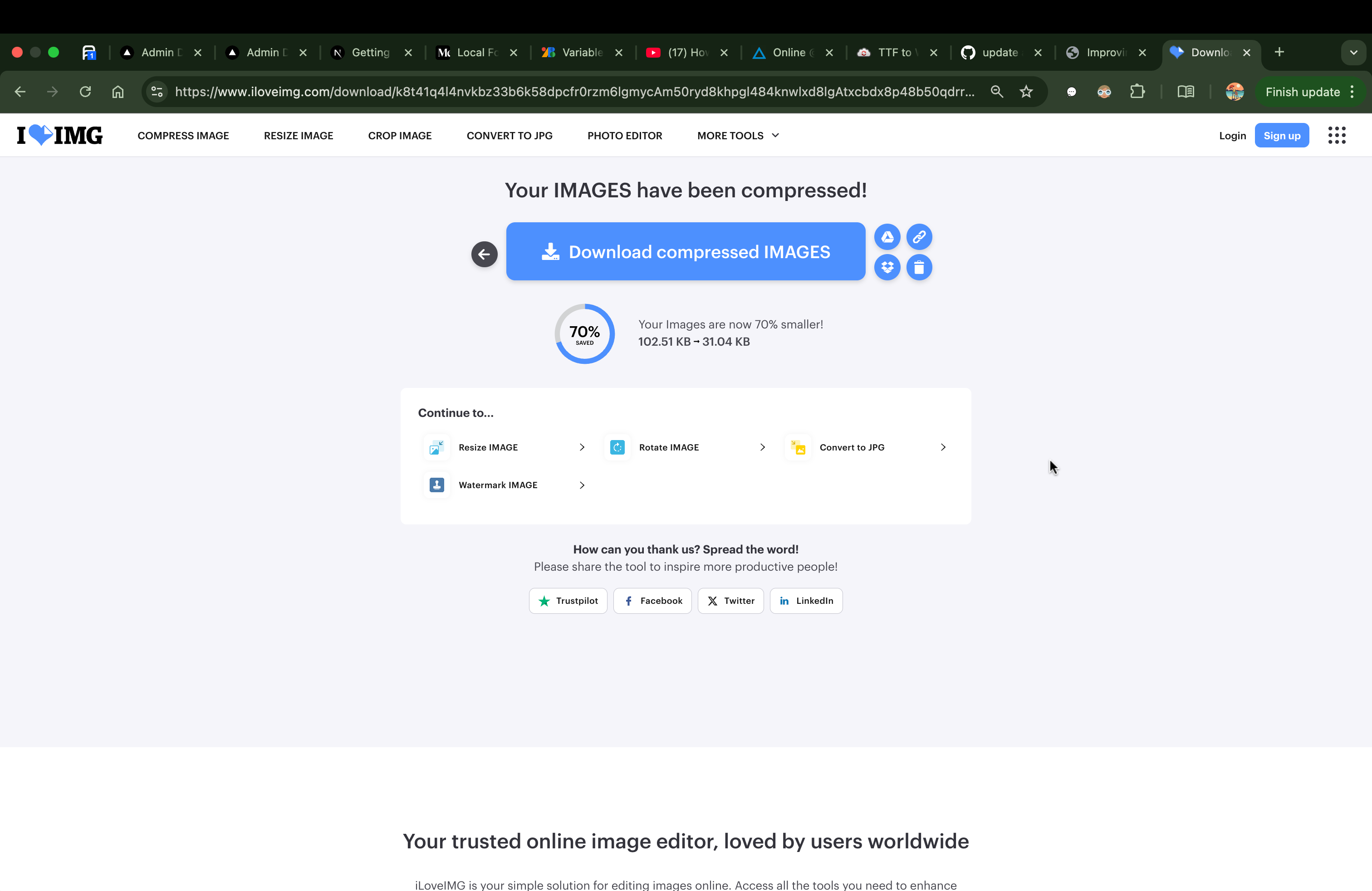
Compressing the images
I use a free online tool to compress all my images. iLoveImg
This will significantly reduce the sizes of the images.. Less size, more faster the images load... but we need to do one more thing.
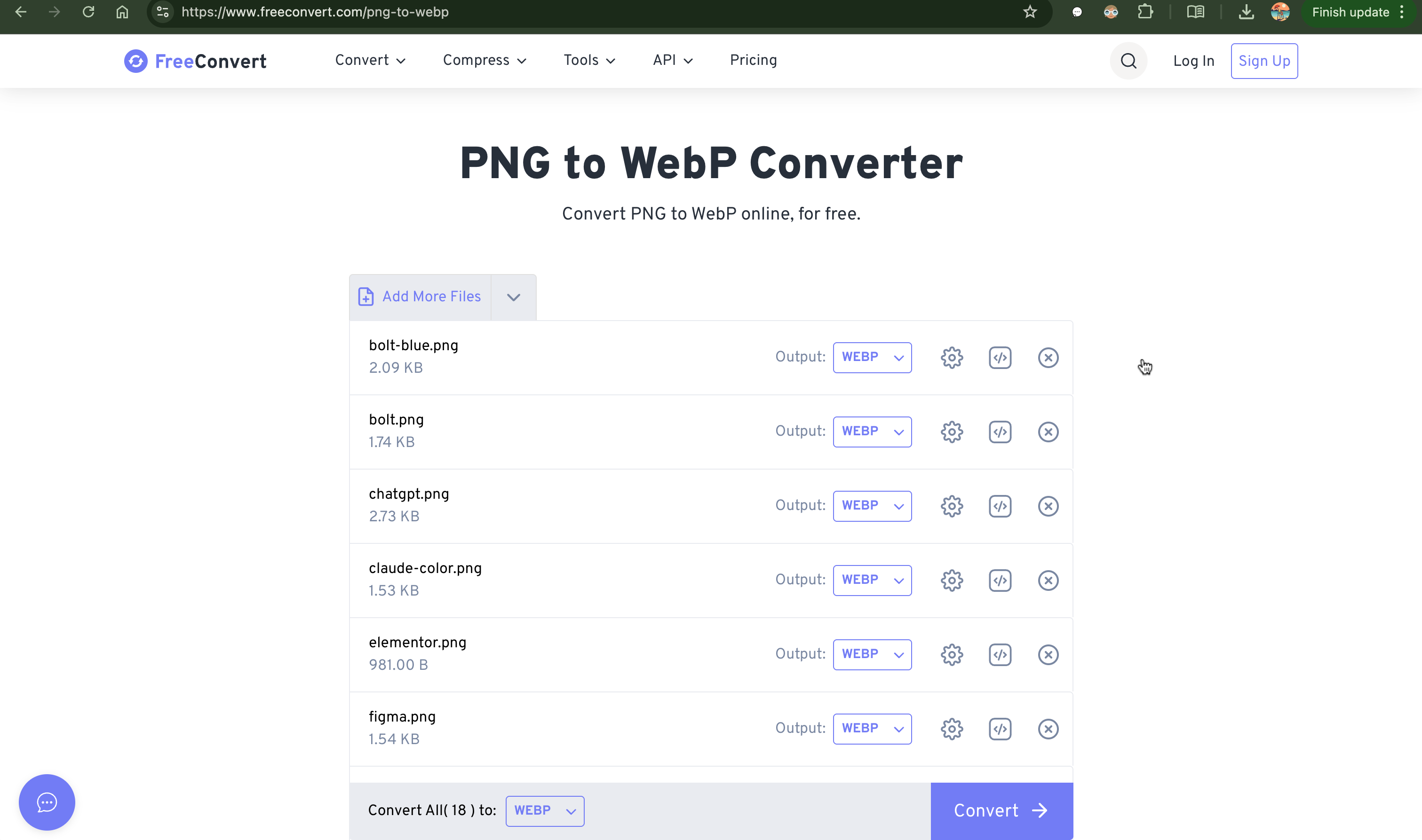
Convert Compressed png images to webp format
It's a good practices to load the images in webp format. (this is kind of compressed images formatted for web). This will also significantly improve our image sizes to be less and helps in loading images faster.
After all this process, finally letting our AutoImageChange component to use the webp images
const techIcons: string[] = [
    "/assets/images/128/compressed/bolt-blue.webp",
    "/assets/images/128/compressed/bolt.webp",
    "/assets/images/128/compressed/chatgpt.webp",
    "/assets/images/128/compressed/claude-color.webp",
    "/assets/images/128/compressed/elementor.webp",
    "/assets/images/128/compressed/figma.webp",
    "/assets/images/128/compressed/framer.webp",
    "/assets/images/128/compressed/hygraph.webp",
    "/assets/images/128/compressed/make.webp",
    "/assets/images/128/compressed/nextjs.webp",
    "/assets/images/128/compressed/payload.webp",
    "/assets/images/128/compressed/strapi.webp",
    "/assets/images/128/compressed/supabase.webp",
    "/assets/images/128/compressed/webflow.webp",
    "/assets/images/128/compressed/zapier.webp",
    "/assets/images/128/compressed/n8n.webp",
    "/assets/images/128/compressed/wordpress-white.webp",
    "/assets/images/128/compressed/super.webp"
  ];

  return (
   <AutoImageChange imageUrls={techIcons} width={128} height={128} />
  );
This felt great and loaded quickly. Now seeing the sizes its reduced significantly and improved the overall lighthouse performance score.
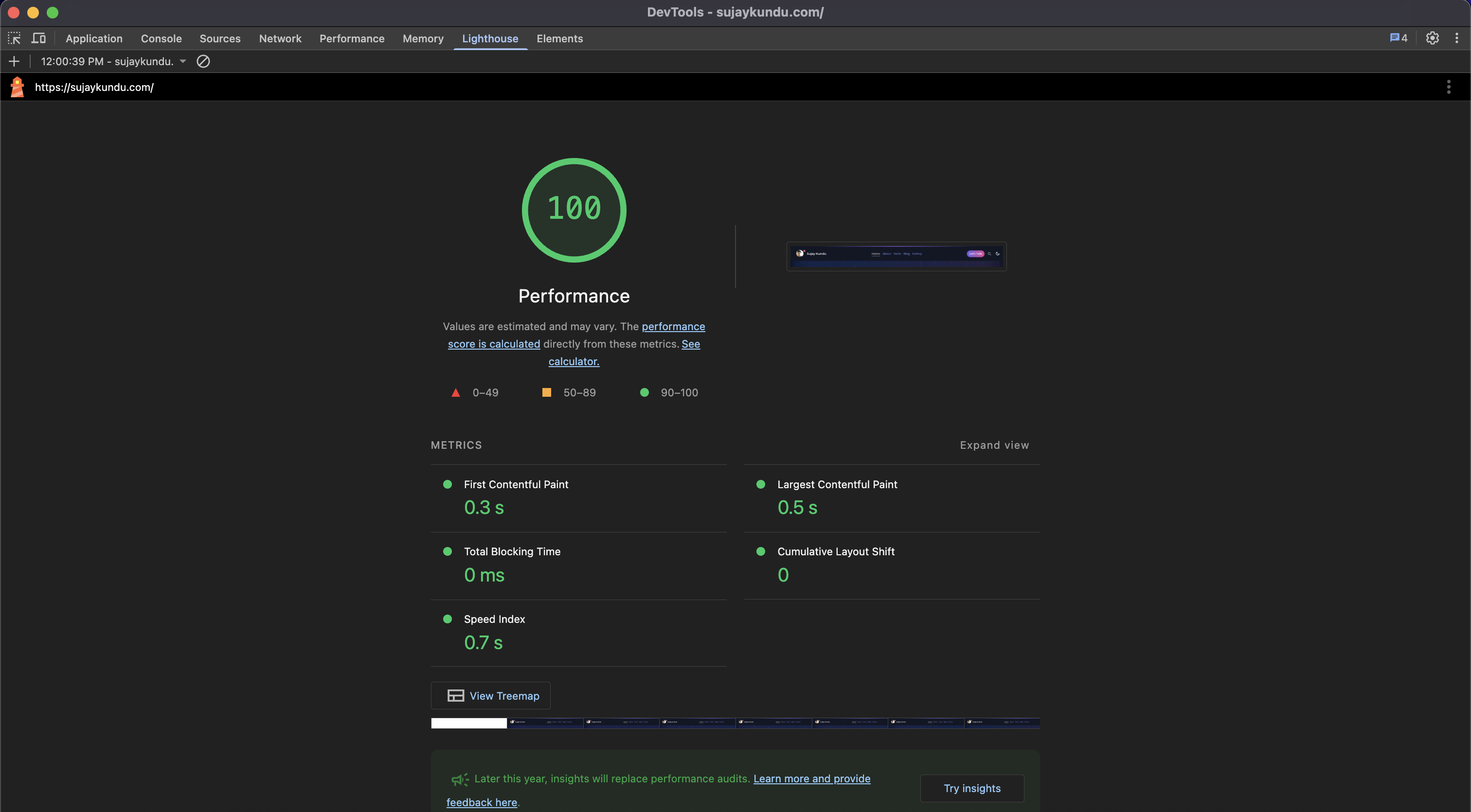
Wohoo ! we achieved Performance Score (100) in Lighthouse.
Yayee ! More perf upgrades to come.
Hope you like this article, and the new site performance.
Checkout the next part - Part-2 - Font Optimizations